I want to draw the query statement below as a bar chart in Kibana.
GET food_info/_search
{
  "size": 0,
  "aggs": {
    "country": {
      "terms": {
        "field": "food.countryCode"
      },
      "aggs": {
        "type": {
          "terms": {
            "field": "food.type.code"
          }
        }
      }
    }
  }
}
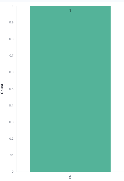
The following code is the result of the code above.
{
  "took": 0,
  "timed_out": false,
  "_shards": {
    "total": 5,
    "successful": 5,
    "skipped": 0,
    "failed": 0
  },
  "hits": {
    "total": {
      "value": 3,
      "relation": "eq"
    },
    "max_score": null,
    "hits": []
  },
  "aggregations": {
    "country": {
      "doc_count_error_upper_bound": 0,
      "sum_other_doc_count": 0,
      "buckets": [
        {
          "key": "CN",
          "doc_count": 2,
          "food": {
            "doc_count_error_upper_bound": 0,
            "sum_other_doc_count": 0,
            "buckets": [
              {
                "key": "burger",
                "doc_count": 2
              }
            ]
          }
        }
      ]
    }
  }
}
The x-axis is the country code, and the y-axis is the number of documents per country code(doc_count). However, the y-axis is not the number of documents, but 1, which is the number of countries.