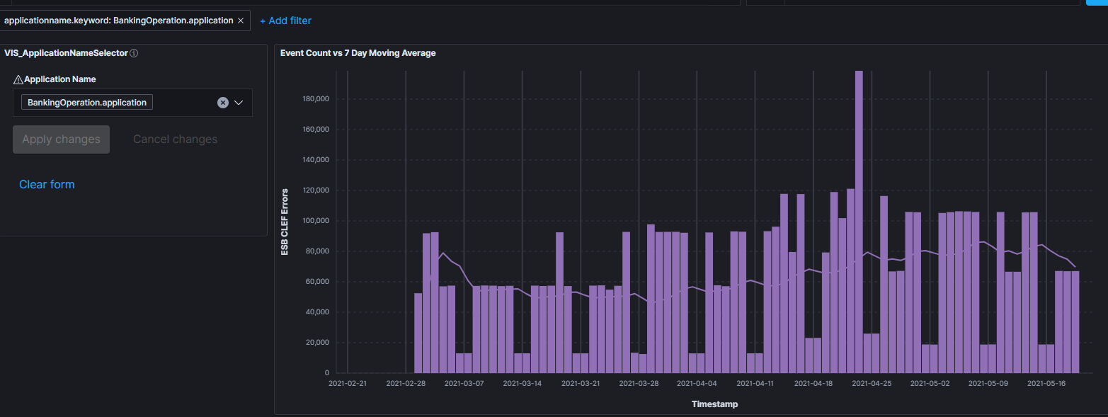
I'm using Kibana to show the count of events for various services received over time. I've been displaying this as a bar chart no problem but would like to also include a moving 7 day average as a line so that the two are comparable on the same chart.
At the moment in Lens I don't seem to be able to do this. Adding the two calculations to the same layer appears to mean they both need to be of the same type (bar or line but not a mix). I tried adding them as two layers, which allowed the 'mixed' chart but resulted in the legend series labels being identical so for a viewer it wouldn't be obvious which was which.
Thanks for the feedback on Lens! You're right that you need to use layers to mix bars & lines. You're also right that the legend is getting cut off, this is something we are working on. Here are my suggestions as one of the Lens developers:
You can add a title to the saved visualization, instead of using the legend to explain the visualization. For example your title could be "Event count vs 7 day moving average".
Since you are filtering to show only one applicationname, you can delete your "break down by" and the legend will show "Event count" and "7 day moving average". If you have very few application names, you add a separate Lens panel for each applicationname, using the "Clone panel" feature to quickly start each one. This only works if the application names are predictable.
You can change the display of your applicationname.keyword field across all of Kibana by editing the field formatter. This might not be what you want, but for example you can truncate the label to only 20 characters, or you can add a Lookup formatter which maps your applications to a human-readable name.
First of all, apologies for taking so long to respond - I've been sidetracked at work with other priorities and this kind of slipped off my radar for a few days.
Secondly, thanks very much indeed for such a quick response - and one that's got some great detail in it.
In my case, we have maybe 25-30 application names already with more being added periodically so creating separate explicit panels for each is probably not going to be the way forward.
I'll take a look into the first and third options and see which works best. I'm not sure I've used the field formatter or lookup formatter before so there'll be some more learning there....!!
Just out of interest, is there any timeline on when the issue with the legends being truncated might be resolved?
@stevedearl We're starting to discuss these long labels and what we can do, so I can't offer a timeline but I can say that this is getting attention. In the long term we're looking at how we can let you easily create 30 panels using similar but different data, but that's not near term.
I actually just noticed another oddity on this issue. When using the two layers to obtain a mixed chart type (bar and line) and viewing in Lens the bar and line are given different colours:
@stevedearl Can you show what happens in the tooltip/legend on your dashboard? The color assignment is based on the name of the series, so maybe the names are the same. If the names are unique then maybe we have a bug.
I think you got it - the names of the series are identical so I guess that's why it's applying the same colours. I think this is another disadvantage/issue of trying to have multiple layers to show the mixed bar/line. As both series are for the same 'application' albeit one is for daily event data and the other is the moving average, they effectively have the same legend.
This is not a bug, but I see how it's confusing in this instance. On dashboards, by default Kibana tries to assign the same color to series names with the same name. As both of you series are called BankingOperation.application, they will get assigned the same color.
You can turn off this behavior (although just for the whole dashboard at once) by opening the "Options" menu and disabling the "Sync color palettes" option.
Yep, I'd agreed with Wylie that this wasn't a bug on your side - just a consequence of how I was displaying to two series with the same name.
Thanks for the tip on turning off the colour syncing. I'll give that a try...!
Apache, Apache Lucene, Apache Hadoop, Hadoop, HDFS and the yellow elephant
logo are trademarks of the
Apache Software Foundation
in the United States and/or other countries.