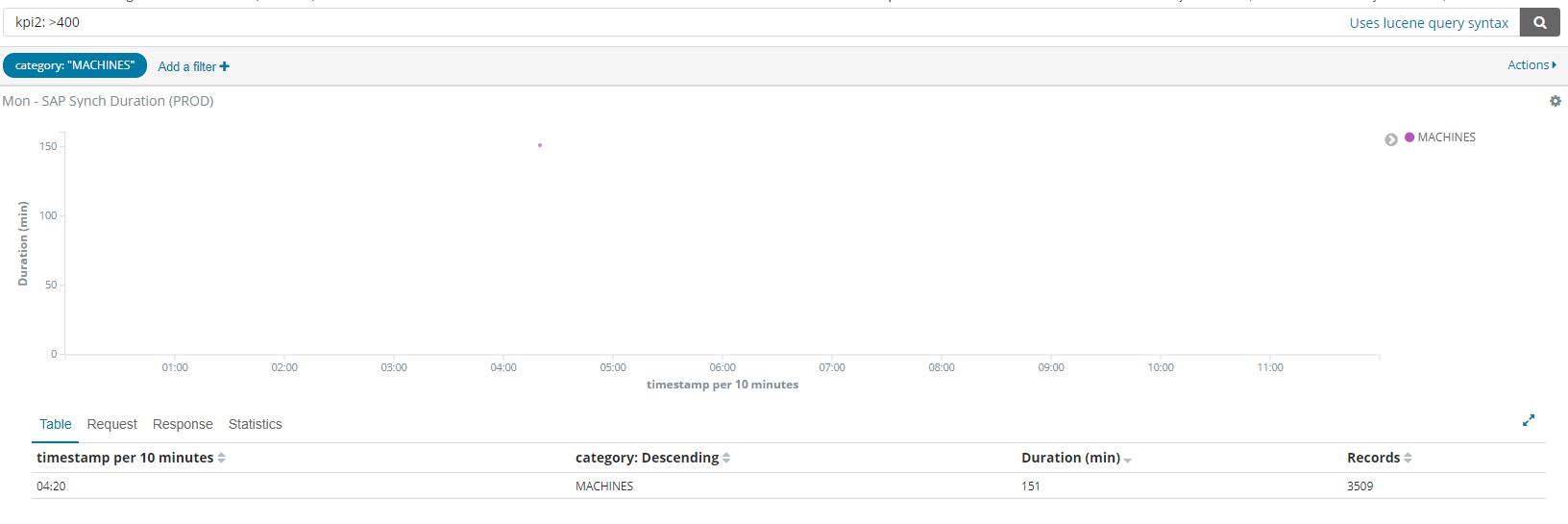
I have a visualisation which shows jobs with their duration in minutes on the y-axis and circles showing how many records were processed.
There seems to be a problem however: some of the circles, shown high up on the chart (between 400 and 500min) have actually a much lower duration (151).
Hi, what kind of aggregations did you select for the duration metric (y-axis) and records (dot size)
If I'm following correctly on what your goal is, it should look right if you select sum aggregation for these metrics, as the numbers you want to see are the combined values for duration and records respectively for that bucket.
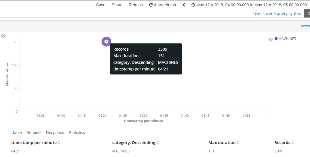
One thing you might be getting caught up by is that when you click a circle and tell Kibana to apply a filter for the data at that selection, the bucket size for the date histogram will usually be smaller, so the bucketed data gets spread between more than just 1 bucket. You start with the x-axis label timestamp per 12 hours, meaning the size of each bucket used to group x-axis data is 12 hours in size. When you filter in, the label changes to timestamp per 10 minutes, and the entire timespan of the chart is 12 hours. At a 10-minute bucket size, data is going to get cut up more than it would at a 12-hour bucket size, so the sum metrics would tend to be smaller.
I should have mentioned that a simple thing you can try to "normalize" the metric aggregations is to set the date histogram interval to "custom" and keep the time bucket size the same no matter what selection of time you have. Choosing "auto" is what scales the bucket size depending on the overall size of the time range.
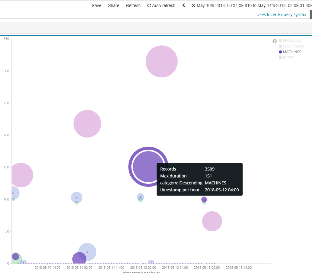
I am intentionally using MAX for both the duration (y-axis) as well as dot size (records processed).
Changing to SUM, though not quite what I want, does not help:
Apache, Apache Lucene, Apache Hadoop, Hadoop, HDFS and the yellow elephant
logo are trademarks of the
Apache Software Foundation
in the United States and/or other countries.