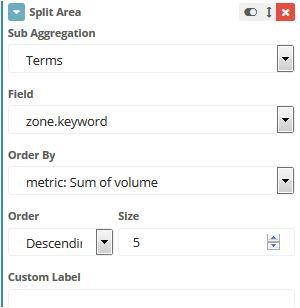
Are you trying to get all the data series into 1 chart instead of split into 3 charts? You can do this by splitting the area instead of splitting the chart when you select "Add Sub-Buckets"
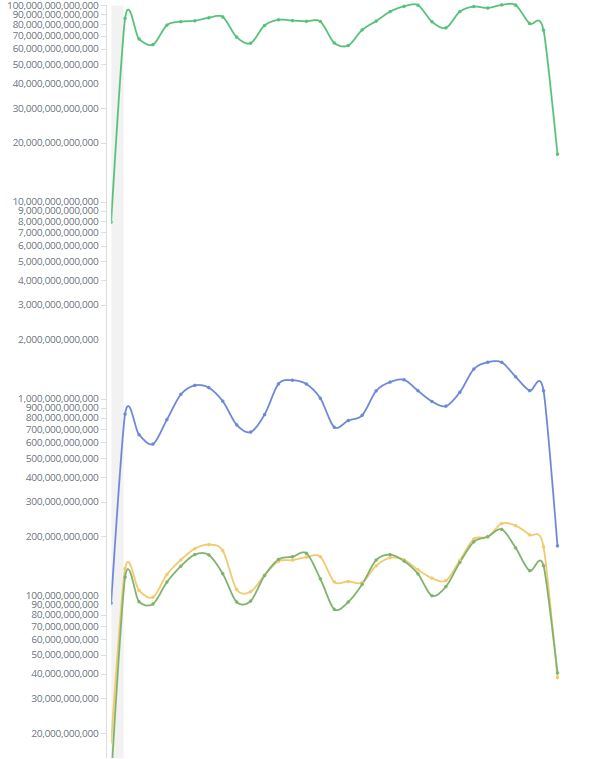
If you plot the data as a line chart instead of an area chart, you can set the Y-Axis scale to use log instead of linear which would certainly help make the data easier to understand.
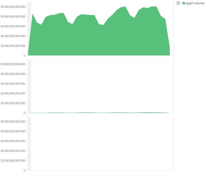
I'm actually surprised to find that Y-Axis Scale isn't available for area chart.
For line and bar charts, you can find the scale-selector in the "Options"-tab. It is right next to the Data-tab. It has 3 options: linear, log, square root. Like @tsullivan suggested, "log" will work better for your data, because the log-scaling downplays large differences in magnitude.
Apache, Apache Lucene, Apache Hadoop, Hadoop, HDFS and the yellow elephant
logo are trademarks of the
Apache Software Foundation
in the United States and/or other countries.