(Sorry I cut off the legend - the individual lines are for different years - explained below).
I have documents with field user_id and then I have scripted fields year and month_of_year which are calculated off of @timestamp.
I defined a line graph where I first did a split lines on term year and then a sub-bucket x-axis on term month_of_year. In both cases I ordered by Term Ascending (with 6 for the year, since my data is 2011-2016, and 12 for the month_of_year). The y-axis is unique count of user_id.
As you can see, something is goofy. Specifically, it seems to have had trouble sorting month_of_year in ascending order. Is this a bug, or did I just configure something incorrectly?
FYI, my goal for this graph is to have a line for each year showing number of unique users by month - for easy year-over-year comparison.
Hi, can you share the following information please?
Versions of Kibana and Elasticsearch.
Definitions of the year and month_of_yearscripted fields. Specifically, what you've entered into the Script text box when creating each scripted field.
The response from Elasticsearch for this visualization. To get this, open the visualization on the Visualize page, then click the little ^ button below the chart. This will pop open what is called the spy panel. In the spy panel, click the Response button. This will show the Elasticsearch response for this visualization.
I was able to reproduce this. You simply need to reorder the aggregations to fix this
So currently you are seeing something like this (the thing to note is that the Split Lines by year aggregation is happening before the X-Axis by month_of_year aggregation) :
Thanks, that does solve this problem. Unfortunately, it leads me to
another problem, where my data values were changing unexpectedly when I add
buckets, which I describe in a separate post here:
Thanks again. I'm glad that reordering the buckets solved the graphing
bug, at least!
Apache, Apache Lucene, Apache Hadoop, Hadoop, HDFS and the yellow elephant
logo are trademarks of the
Apache Software Foundation
in the United States and/or other countries.
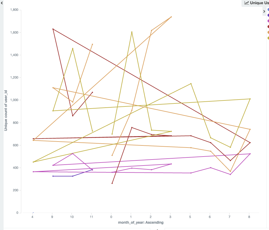
 Specifically, it seems to have had trouble sorting month_of_year in ascending order. Is this a bug, or did I just configure something incorrectly?


