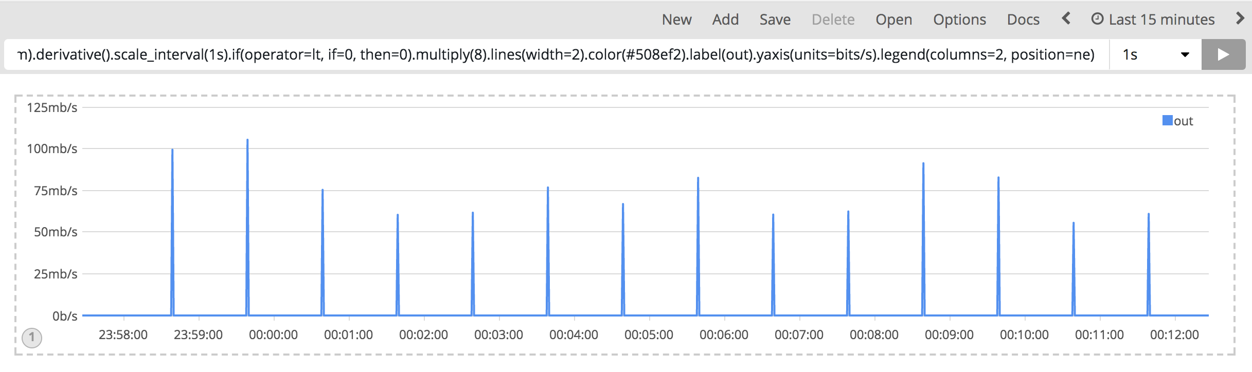
I got the followed graphic:

From the data:

Query:
.es(kibana=true, index=metricbeat-*, timefield=@timestamp,
metric='sum:system.network.out.bytes', q='system.network.name:eth0')
.mvavg(1m)
.derivative()
.scale_interval(1s)
.if(operator=lt, if=0, then=0)
.multiply(8)
.lines(width=2)
.color(#508ef2)
.label(out)
.yaxis(units=bits/s)
.legend(columns=2, position=ne)
Ps. formated code for view
It seems because the metricbeat got the data delayed ONE secend.
And then, try the 2 mins interval:

The problem is same, but only the maximum is average. I had change the mvavg(2m).
I think it maybe a zero data problem. but after I set the interval to one second for recently. It look better.
How could I resolve this problem?
Is a way to filter the data over a error thresholds?
Thanks for any information.
