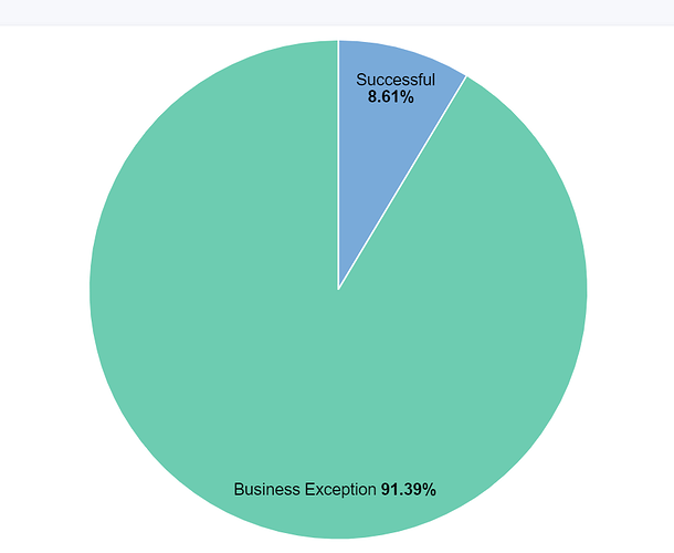
Hi,
I'm new using Kibana and I have some questions regarding working with pie charts.
There are two things that I've been trying to do but I have not been able to:
- With a KQL query I was able to handle my data and get all the Successful and Business Exceptions from some production logs I have. Now I would like to be able to click on "Business Exceptions" and be able to have a second pie chart inside in which I'm able to see the classification of the different business exceptions that ocurred:
When I click inside Business Exception I get this:
Is there a way I can classify the business exceptions based on the full log message?
2) I found online that people are using the outside circle in order to see the classification such as in the example below:
I would like to group all the messages from the outside circle that follow the pattern "is not required nor listed" under one single slice. Right now I have an ID in each one of these messages so I end up with 150 slices that are basically the same business exception. I would like to have the messages that don't follow this pattern under their own slice of the outside circle.
I hope I made myself understandable!
Thanks in advance


