Hello,
I use TSVB to visualize data that is being sent every 1 minute to Elasticsearch.
The problem is, sometimes the data takes a little bit more time to be calculated, and so it is being sent after 1 min and 5 seconds, etc.
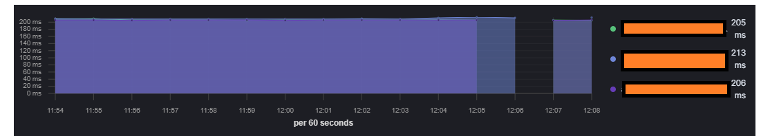
Because of that reason, when aggregating the data every 1 minute, sometimes there are empty buckets, and that's leading to some ugly gaps in the visualization: (here the visualization interval is 1m)
When I reduce the Interval to 30s the data is presented as dots, which doesn't look as clear and informative..
How can I avoid the gaps, but also visualize the data smoothly?
However, there are a few capabilities that I can't seem to find in Lens and would like to get some help-
I'd like to add "ms" word near the values, as I did in TSVB. I tried to do in Lens but that's all that appears in the Format & style popup:
Is there a way to do in Lens?
In Lens I used the "Break down by" option and broke down the data by server address.
However, I'd like to present only part of the values. How can I predefine which exact values I want to present in the visualization?
The formatting option you're asking for isn't currently possible in Lens, but I'm working on a PR to do this across Kibana if you add it to the field: https://github.com/elastic/kibana/pull/76729
I don't understand the behavior you are looking for with IP addresses, can you be more specific? You probably haven't missed something, there aren't very many options today.
If you want the top N IP addresses, Lens supports that by putting the IP aggregation first, as in "Top values of IP field overall" as opposed to "top values per timestamp".
It sounds like that's not what you want, and I can think of three possibilities. Can you indicate which one you want?
You want the top IP addresses, but excluding some values
You want to write a KQL filter which matches certain IP addresses
You want to write cidr ranges to match specific IP ranges
Apache, Apache Lucene, Apache Hadoop, Hadoop, HDFS and the yellow elephant
logo are trademarks of the
Apache Software Foundation
in the United States and/or other countries.