Is this possible?
I have Field A, Field B and Field C.
I want a graph (bar graph, maybe pie chart too) where I can compare all 3 of those sums, not on a time scale or anything, just for the time queried.
Thanks for any help!
Is this possible?
I have Field A, Field B and Field C.
I want a graph (bar graph, maybe pie chart too) where I can compare all 3 of those sums, not on a time scale or anything, just for the time queried.
Thanks for any help!
hi @ghivert,
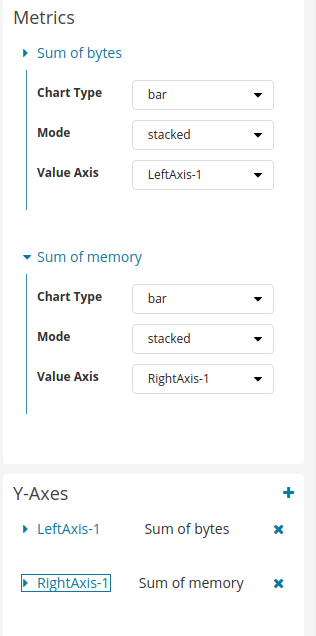
you would just add multiple sum-metrics and then create a bar chart. It would look something like:
For this example, I also created two axes (one for each metric). Select this in the metrics&axes tab.
© 2020. All Rights Reserved - Elasticsearch
Apache, Apache Lucene, Apache Hadoop, Hadoop, HDFS and the yellow elephant logo are trademarks of the Apache Software Foundation in the United States and/or other countries.