I use a dashboard with a graph in an external application via iframe. The datetime range selector is hidden because we don't want that the user changes the settings for the period. Otherwise the user can zoom in (what is great) but then we get a problem. Expect we started from a period of a week (the day is shown in the datetime axis, when zooming (and the period is only a few hours) you get only a time indication in the axis and you don't know the date from the data. Is there an option that you can change the setting for the axis to always include the date or maybe better, can I include some (text)fields on the dashboard showing the actual period for the graph?
Hey @marcw. You can change the axis setting to always include the date. You should go to the Advanced settings and find this setting (Scaled date format)
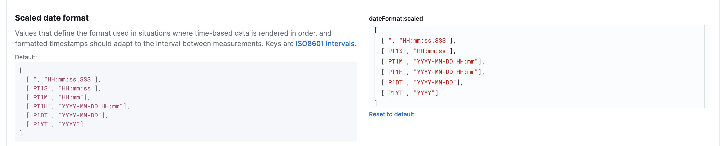
You can change the format that your date renders. So for example here, for small intervals (minute scale) I have changed this ["PT1M", "HH:mm"], to ["PT1M", "YYYY-MM-DD HH:mm"],.
Now my date axis displays the full date for small intervals.
An important note for this setting is that it will change the axis scale for all your visualizations (it is a global setting)
thanks, problem solved.