Hi, I have the file log below and I want to draw a colored circle in function of the input : "header.message" (green for sucess and red for failure).
PS: I want to do that just for the last document. thanks


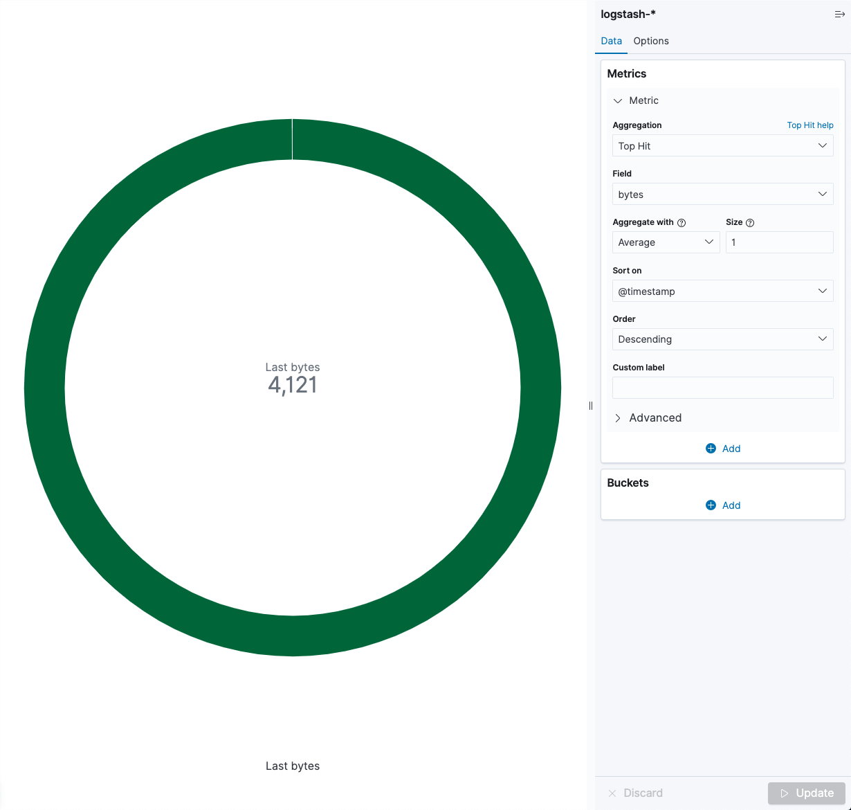
There are a couple of ways to do this in Visualize using Gauge/Goal type visualizations. The gauge and goal visualizations expect numeric data, so first we would have to use a scripted field to turn the messages into numbers, something like 0 for failure and 1 for success. Then we can create a Goal visualization with a Top Hit metric on the scripted field we've created, and configure the ranges so that a 0 value will display a red circle and a 1 value will display a green circle. It would look something like this:

If you specifically need a filled in circle, you could do the same thing with TSVB's "Gauge" visualization which has a filled in circle as a display option.
I think you could also do this in Canvas easily without needing to create the scripted field first, but I am guessing you want to but this on a dashboard beside other basic visualizations.
Hi, I used scripted field to create a numeric field 'testField'. Here is the script :
doc ['header.message'] == "failure" ? 0 : 1
But I can't bring up the value 0 for failure and 1 for success. And load my documents
Thank you for your help
