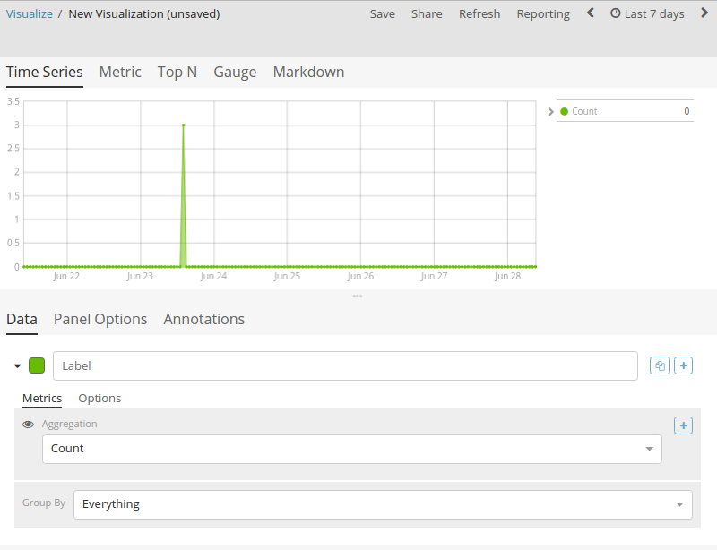
Probably something I didn't understand well with time series.
Wanted to display in gauge the number of port down since 1w, so a count of documents filtered by type:tcp AND up:false.
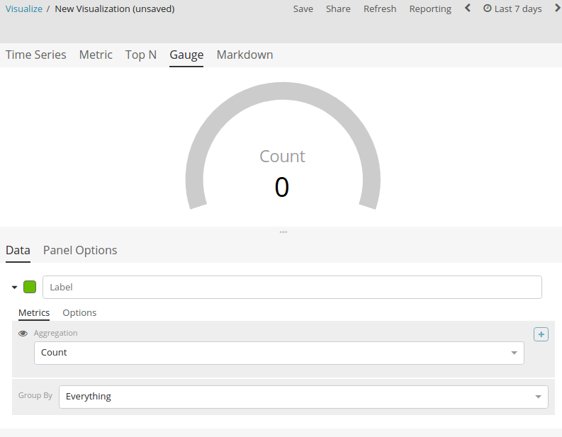
Seems like I can see the graph, but when I switch to gauge, it always displays 0.
Have you tried adding an Overall Max (pipeline sibling agg) to the series and then choosing the count aggregation as the metric? ON the time series visualization that will draw a flat line for the max of the series and on the gauge I think it will display the number you're looking for.
Apache, Apache Lucene, Apache Hadoop, Hadoop, HDFS and the yellow elephant
logo are trademarks of the
Apache Software Foundation
in the United States and/or other countries.