Hello,
My Kibana visualization has an unintended side effect.
Some background: my heatmap shows red or green boxes based on the number of failed tests (>= 1 failed test gives red box). The horizontal axis represents the release and the vertical axis is the feature being tested. Check out this image for an example:
The problem happens when I use the "Filters" function. When adding visualization-wide filters based on other criteria (e.g. only show passed tests) all of the boxes keep showing even though they may not have any relevant results. If I use "Top Values" for both axes, this problem goes away.
I would like to have Feature1 disappear from the results as is the case with my other visualizations that use Top Values. Otherwise, it can be very misleading because it looks like Feature1 is now passing all tests.
Please let me know if you need more info/clarity. Thanks for any replies.
-Ryan
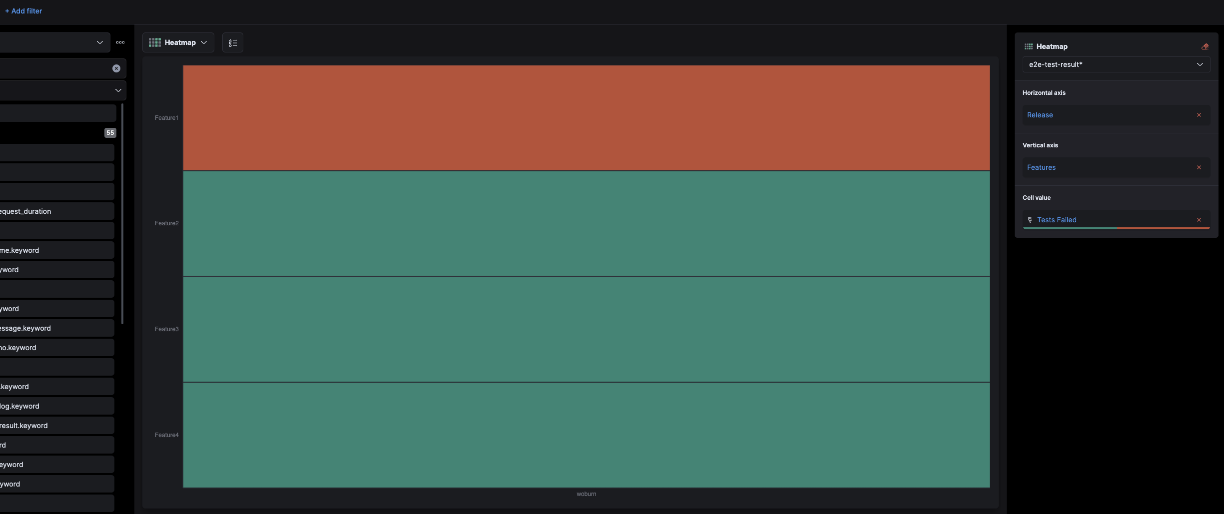
I could not include this image in the original post. This is after applying a visualization-wide filter. Notice how the test that was showing red is now showing green instead of disappearing altogether.
I think an explanation on how the filters work here: when you set a filter it doesn't do filter the results of the query. It filters the documents in elasticsearch first and then does the query on that. So if you remove "failed" it won't have a count of failed > 0 for Feature1.
Thanks for getting back to me @Marius_Dragomir.
I understand that. My issue is in the difference between count of failed == 0 vs no results to query against.
In other visualizations, the box would disappear if there are no results related to it. In this scenario, the box is staying on the page. This problem only happens when I use the "Filter" function inside the visualization. Note that I am referring to two different "Filter" functionalities.