Hi, and thanks for the wonderful Kibana. Our company started to use it for analysing our users' behaviours so here's a list of issues that were near showstoppers (or minor annoyances) while starting to use Kibana. Is there a roadmap where we could see whether any of these are going to be addressed soon, or is there some kind of forum for voicing this list as feedback? It is of course possible we've just missed something, and if so please let us know! Thanks.
*When mouse hovering over graphs the area charts don’t display the max value in the info picker. Conversely, hovering over Timelion graphs don’t show the time value. This is almost a showstopper as you kinda have to resort to photoshop or such to see the exact time value when hovering over a Timelion graph, or to see the total value of a split area chart.
*There should be better control over a chart's interval. Use case: We have a chart showing daily active users. The default time range of the dashboard is last 7 days. We have set the interval to 1d, as auto shows too much noise in the weekly view. This makes it impossible to select a shorter time range (like last hour) as the chart will show its contents fit to days, effectively coming up blank. Selecting a longer time range works though.
Could a change be made so a chart would go to auto mode by itself if the selected time range is shorter than its interval?
*If a chart requires math of any kind (where data come from separate queries) Timelion must be used. This is far harder to use than the wysiwyg graph editor. Fortunately, most of the game metrics are discrete enough that they don’t need this pass. Any plans of adding a feature similar to Amplitude's custom formula editor or such?
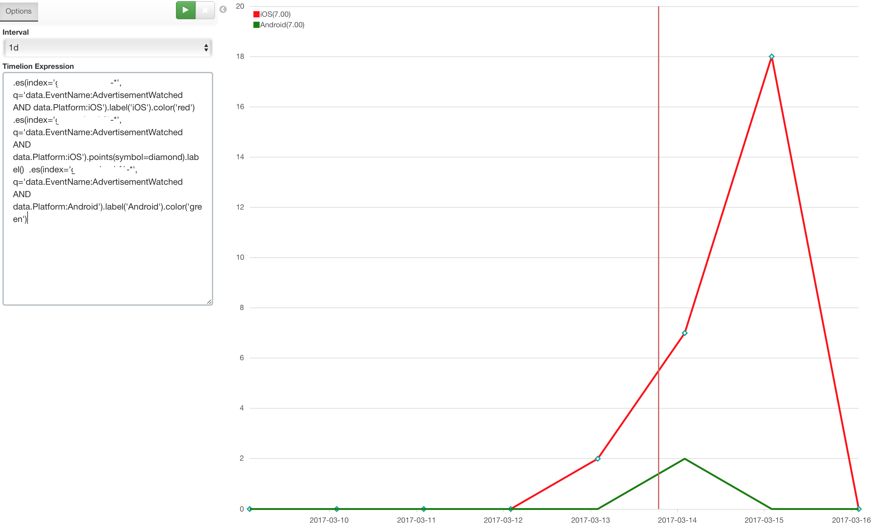
*There is no way to plot a line graph’s total value, or add multiple y axes, in the wysiwyg editor. So Timelion must be used for creating line graphs where we want to show a total value of all the splits. Use case: we have a graph showing accumulated revenue split by platform type, and would like to have one line which shows the TOTAL amount of all splits.
*If using split series in Timelion, there is no way to select which color goes to which split. If this is needed manual setup of one query per split is required. Use case: we want to use standardised colors for different platforms (red for iOS, green for Android and so on).
*Bug: Timelion - A javascript error is thrown if you define more colors than a split series outputs, effectively making the .color('a:b'c') option unusable in Timelion for other than extremely defined data.
*There is no built-in .divideseries() in Timelion, making math on split series impossible. We are using a plugin for that, but it crashes if the split series are different in divider/divisor. We only use .divideseries() if the event is the same in both divider and divisor, else manually set up one query per split. This is extremely cumbersome and error prone.
*When having to do manual splits (one query per split) in Timelion (see above), there doesn't seem to be a way to hide the series that didn't have any data. This creates a discrepancy between the graphs using splits (showing only the splits with data), while the manual query splits are always there.
*There is no way of making unstacked (side by side) bar charts in Timelion (.bars(stacked=false) just stacks the bars differently).
*Bug: Using the label() expression in Timelion with an empty string prevents the label from being drawn, but all consecutive labels’ values are offset by one. This is very dangerous as the graph shows correct values but the labels incorrect values.
*Bug: Pie chart labels don't work, they will just show the auto-generated expression string.
*Annoyance: Creating a new chart resets time period to 15 minutes, so graphs can show weird data until that is corrected. It is very easy to miss and wonder why the chart shows weird stuff.
*There doesn't seem to be a way of sending in any kind of parameters to a dashboard in a convenient way. Use case: We have embedded Kibana dashboards in an iframe without showing the Kibana UI. We'd really need a way for the analytics users to be able to pick, for example, a country filter. If the Kibana UI is hidden there is no query bar visible. Also, even if there was it'd be a very hard sell to tell the analytics users to learn the query language. It would be far better if there was a widget you could create for sending in formatted parameters (like a country selector).
EDIT: Found that you can control the query by url parameters, so we'll just make external controls for that. Would of course be nice if it was built in, but at least this is solvable.
Thanks for reading this,
- Tommi