Hi Angelos,
Thank you for your question! Whilst the timeline components used in the ML Anomaly Explorer dashboard are not available as Kibana visualizations, you can create something similar with the Kibana Heat Map visualizations.
The first step is to create a Kibana index pattern against the .ml-anomalies-shared index used for storing the ML results (assuming you aren't using a dedicated index for your ML job). This is done through the Index Patterns page under the Kibana Management tab. Make sure you have 'Include System Indices' checkbox selected so that the '.ml-anomalies-shared' index shows up:
In step 2 of creating the index pattern select timestamp as the time filter field name.
You can then switch to the Kibana Visualizations page to create a Heat Map visualization, selecting the .ml-anomalies-shared index pattern you just created. To see results for your specific job make sure you add a job_id: yourjobid query to the page.
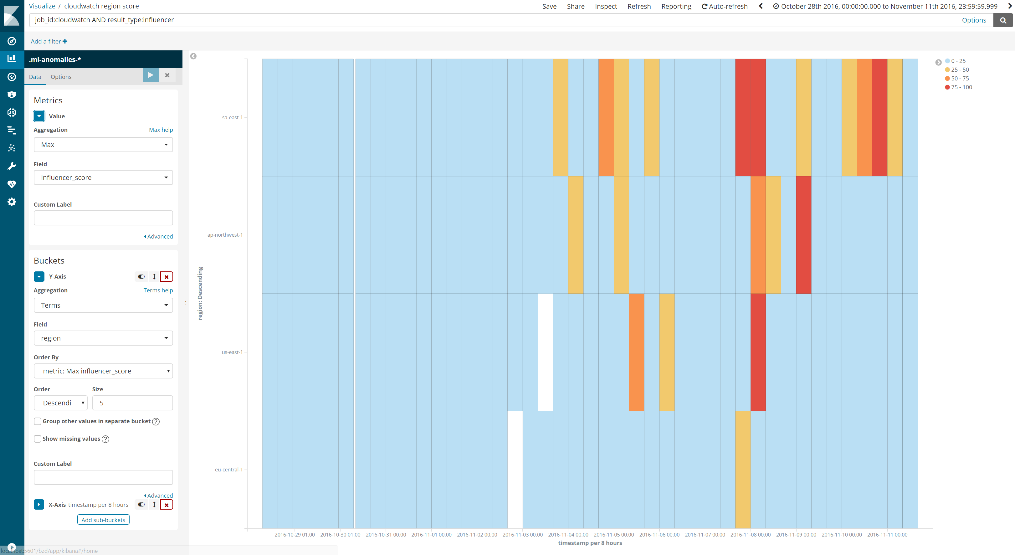
To recreate the 'view by' swimlane, you want to query for result_type:influencer and then plot max influencer_score as the metric. To split by e.g. product, add a terms aggregation for the y-axis, splitting by product, ordered by max influencer_score, and use a Date Histogram for the x axis. You can then customize the colors for the Heat Map using the legend control to the right of the visualization.
Here is an example of one I created for a multi metric job, where I am splitting by a region field:
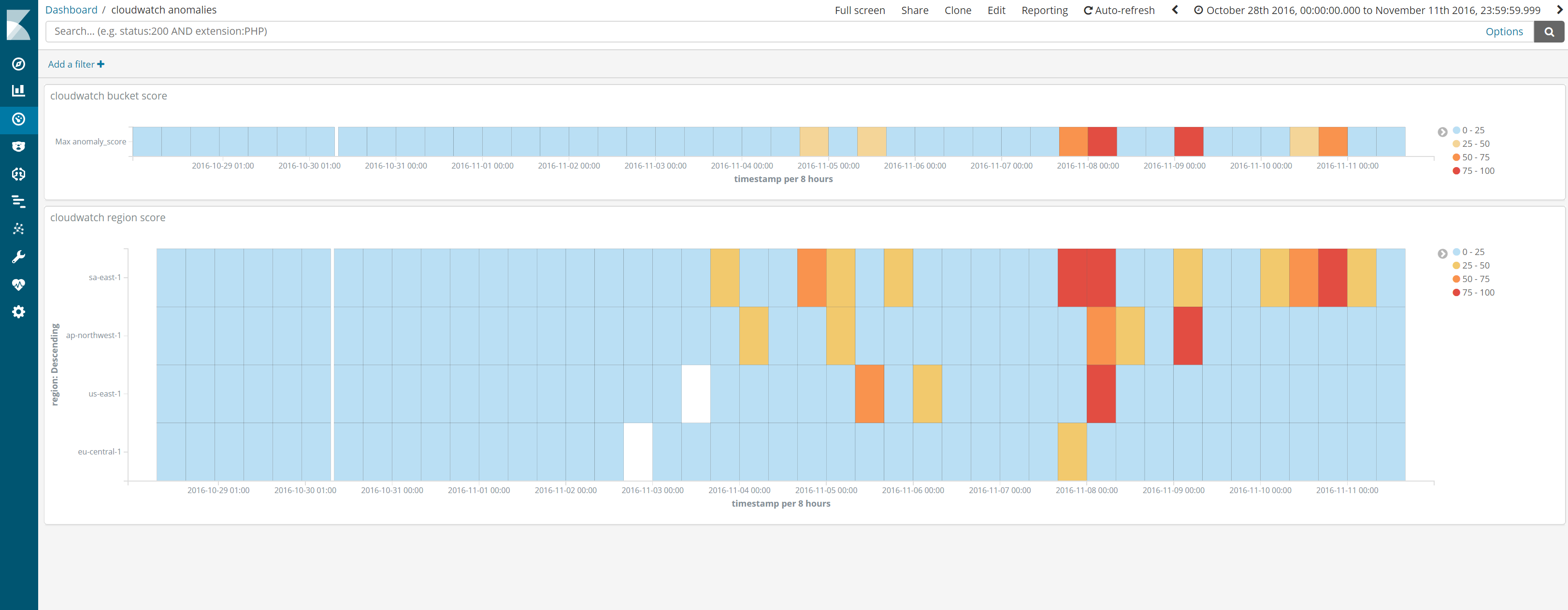
To recreate something similar to the Overall timeline, you should query for result_type:bucket and select max anomaly_score as the metric. Just use a Date Histogram for the x-axis, and no need to split the data.
Here is what the visualizations look like when added to a Kibana dashboard:
which compares well to the ML Anomaly Explorer:
Note that you have to be wary of adding any additional queries or filters to your Kibana dashboard, as the field you are querying on may not exist for every result type in the .ml-anomalies-shared index.
For more information on the various types of results and scores for machine learning anomalies, take a look at this blog.
Another option to recreate the swimlane visualization is to use the swimlanes plugin, although this is an external plugin so needs to installed into Kibana separately, and updated whenever you update your Kibana version.
Hope that helps! Please let me know if you need any more help with any of the above steps.
Pete