I already described my problem with the Dashboard Grid here.
If it is not possible to make the grid thinner, can I at least set a maximum number of lines on the Y-Axis? My current range is from 0 to 25 GB and I have 13 lines in my chart, even though it is only about 10 cm high. About 8 lines would be perfect.
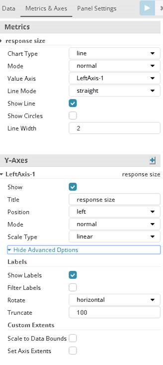
@Helix would you mind sharing a screenshot of the visualization configuration and what you're intending to visualize? A large number of X-Axis aggregations have the "Size" parameter which can be used for this.
This is unfortunately not possible, also probably won't be in the near future as our general approach when it comes to visualize is to try to provide good experience out of the box and not show every possible option to the user.
Apache, Apache Lucene, Apache Hadoop, Hadoop, HDFS and the yellow elephant
logo are trademarks of the
Apache Software Foundation
in the United States and/or other countries.