Hi,
I've been working within Kibana to create some useful dashboards with custom fields. But it appears the "Controls" visualization doesn't properly adapt to the established filters of one's dashboard.
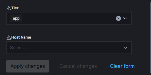
For example - Say there are 3 tiers I'm searching between... Product, Tier(App, Web, DB), and then individual hosts. (All previously defined and set to fields in metricbeat)
In a drop down.. if I apply the top drop down to a specific product, and then the tier -- then hit apply -- shouldn't the Host Name drop down only suggest Hosts from that particular filter? Instead it appears to list any host from metricbeat as it seems to disregard the dashboards filter and instead only run off of the drop downs specified filter.
If there's a way around this -- simply to make searching more effective for non-elastic users -- or perhaps a planned change to this implementation I'd love to hear about it.
Thanks.
Type of visualization: