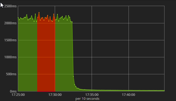
Is it possible to create multicolor timelines depending on variables?
Lets say that we have some database request response/s for some value that can be either true or false.
How can I create dashboard visualization that would look like this:
Where it is green if value is true and red if value is false?
I did check experimental builder annotations but there you can only create icons.
That's currently not possible. It's also a bit difficult to imagine how that would work, since each point would be a date histogram aggregation, and thus not necessarily be an individual document, but could be the average response times of all documents within that time frame. How should that look, in case a point groups documents, that has true and false values in there?
I was hoping it would work in similar way to annotation in experimental tool where you can specify index, time field, query and fields. If Annotations can do it then it could be possible to remove the icon and change the integrate line to the graph:
Apache, Apache Lucene, Apache Hadoop, Hadoop, HDFS and the yellow elephant
logo are trademarks of the
Apache Software Foundation
in the United States and/or other countries.