Hi,
I got data like
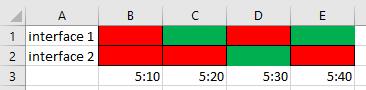
name = "Interface1", status = "down", time="5:10 "
name = "Interface1", status = "up", time="5:20 "
name = "Interface1", status = "down", time="5:30 "
name = "Interface1", status = "up", time="5:40 "
name = "Interface2", status = "down", time="5:10 "
name = "Interface2", status = "down", time="5:20 "
name = "Interface2", status = "up", time="5:30 "
name = "Interface2", status = "down", time="5:40 "
Is it possible to create a chart and update bars with green and red color based on the status?
example:
Thanks.